Initial Ideas and Proposal
Layout:
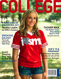
For my college magazine I would like my layout to be similar as the image below. For my image I would like it to be mid shot of a college student in a happy atmosphere. I would like my masthead to be simple but effective and I would like it to stand out so it can be seen from a distance to attract consumers.
Cover Lines
For my magazine I would like my cover lines to relate to my audience. From the image above, you can see the cover lines are to relate to teenagers lifestyles. I would like to approach the same aspect but instead of lifestyle problems (e.g. she’s 15 and pregnant) I would rather have a magazine to do with teenager’s hobbies and leisure’s, for instance music, as music is universal. I would like my cover lines to be laid out in the same places as the image above. For my puff/plugs I think an idea such as money off or coupons would attract student’s, as the majority of teenagers don’t have lots of money.
Masthead and Fonts
For my masthead I have chosen a few names for my magazine’s, which are:
· College Express
· College Life
· Six Form
· College Daily
I feel ‘College Express’ sounds effective as it sounds modern and fresh. For the font of my masthead I would like it to be bold and in sans font.
· COLLEGEexpress (Modern and effective)
· COLLEGEexpress
· COLLEGEexpress (modern and fresh)
· COLLEGEexpress (too feminine and will not suit my male audience)
· COLLEGEexpress too feminine and will not suit my male audience)
· COLLEGEexpress (too bold and not clear)
I think the third font look the most effective and as a teenager myself, I feel the text is modern and almost digital which relates to teenagers generation upbringing as technology is a big part of most of their lives.
I did take a quick survey of the pupils in my class and asked them for there opinions on the fonts, in result the third font was the most popular and running up was the first font. Both of these fonts are modern and are almost digital, which relates to my audience.
Colour Scheme:
I think having general and simple colours such as the primary colours are effective and suit both genders so my magazine will have a broader audience. However simple colours matched with vibrant colours make the text standout. However I do not want my text to clash with my image.
Images:
For my images I would like mid shots of student/s around the college. Like the ‘College’ magazine above, I think having a student outside is effective as it makes the magazine almost look friendly and the colours of image attract me as a audience and having a similar image on my magazine will have the same effect on other people.
Audience:
I am generally aiming my magazine at college students around the age of 16-20. I have chosen this audience as its a college magazine so the majority of other audiences won't be interested. Also as a student of a college myself I can relate to my target audience and can offer certain aspects of my knowledge and experience of my college. I am aware that for my magazine I need to include the whole college for example I am taking media, so I can offer my knowledge of that subject, however I am unaware of engineering so I would have to do research of y audience to offer a broader magazine.
Genre:
As my magazine is a college magazine, my genre is broad, for example I will include sport and music as they are universal and the majority of teenagers enjoy these subjects.
Publishing:
Some magazine have seasonal selling times, What I mean by this is certain magazine will be released and sold around a season. A example of this is the fitness magazine 'Zest' and it is mainly advertised and put at the front of the shelf around summer time. With my genre of magazine it can be sold any time, however for example at exams time, I can have a special edition magazine focusing on exams. I would publish my magazine weekly as most magazines do, and I would like my magazine to update my audience with the latest news, so it has to be published weekly.
Dimensions:
Most magazines are around the a4 size, however I would like to offer my audience a compact size (a5), as it will be practical and wouldn't take much space in there bags. I would also offer a a4 size to follow the trend of most magazine.
Dimensions:
Most magazines are around the a4 size, however I would like to offer my audience a compact size (a5), as it will be practical and wouldn't take much space in there bags. I would also offer a a4 size to follow the trend of most magazine.

No comments:
Post a Comment